Good design doesn’t just look good — it works.
Keep it clean. Keep it human. Keep improving.
✨ Want more simple but powerful design ideas?
Join Nas Studio
https://news.1rj.ru/str/NASEXPRIENCE
Abstract shapes and bold colors can capture attention instantly. Use them with purpose — to highlight key elements, express emotion, and create visual rhythm without overwhelming the layout
#NasStudio#design#UIUX
Make sure to join the channel 👍
https://news.1rj.ru/str/NASEXPRIENCE
Neumorphism — The Soft Comeback of Depth in Design
Neumorphism blends the realism of skeuomorphism with the simplicity of minimalism — creating a soft, tactile, almost touchable interface style.
It emerged as a response to the flat, lifeless look of early minimalist designs.
Think subtle shadows, pastel tones, and elements that look pressed into the surface — calm, modern, and refined.
✨ Why it stood out:
-It brought depth and emotion back to digital interfaces.
-Created a more “real” and tactile user experience.
-Visually felt cleaner, warmer, and more human.
⚠️ But here’s the catch:
Its beauty came with trade-offs — poor accessibility, low contrast, and complex implementation.
Still, neumorphism shaped how we think about visual tactility today — inspiring hybrid styles likeglassmorphism , claymorphism , and modern soft UI trends.
Design isn’t static — it’s an evolving balance between function and feel.
💡 Want more bite-sized design insights, UI/UX discussions, and creative tips?
https://news.1rj.ru/str/NASEXPRIENCE
Neumorphism blends the realism of skeuomorphism with the simplicity of minimalism — creating a soft, tactile, almost touchable interface style.
It emerged as a response to the flat, lifeless look of early minimalist designs.
Think subtle shadows, pastel tones, and elements that look pressed into the surface — calm, modern, and refined.
✨ Why it stood out:
-It brought depth and emotion back to digital interfaces.
-Created a more “real” and tactile user experience.
-Visually felt cleaner, warmer, and more human.
⚠️ But here’s the catch:
Its beauty came with trade-offs — poor accessibility, low contrast, and complex implementation.
Still, neumorphism shaped how we think about visual tactility today — inspiring hybrid styles like
Design isn’t static — it’s an evolving balance between function and feel.
💡 Want more bite-sized design insights, UI/UX discussions, and creative tips?
https://news.1rj.ru/str/NASEXPRIENCE
This media is not supported in your browser
VIEW IN TELEGRAM
sample animation work .
If you’re into UI/UX, frontend, or creative design, animation and product design, I’ve started sharing more of these insights and visuals through Nas Studio — a small creative space I’m building to learn, share, and grow 🌱
💬 Join me here:
https://news.1rj.ru/str/NASEXPRIENCE
If you’re into UI/UX, frontend, or creative design, animation and product design, I’ve started sharing more of these insights and visuals through Nas Studio — a small creative space I’m building to learn, share, and grow 🌱
💬 Join me here:
https://news.1rj.ru/str/NASEXPRIENCE
🔥4❤🔥1⚡1❤1
This media is not supported in your browser
VIEW IN TELEGRAM
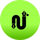
🎉 Big News — We Have a Logo! 😌✍️
After countless pixels, questionable coffee choices, and arguing with my own creativity…
NASSTUDIO finally has a logo! 🎨🔥
It’s bold.
It’s creative.
It’s shaped like an “N” that went to design school and never stopped flexing. 😉
This mark represents where we’re heading —
UI/UX, Front-end, Graphics, Creative madness + learning journey 🚀✨
More design tips, case studies, and creative chaos coming soon.
Stay tuned 👀
And yes — this is just the beginning 😉
👇 Welcome to NASSTUDIO
https://news.1rj.ru/str/NASEXPRIENCE
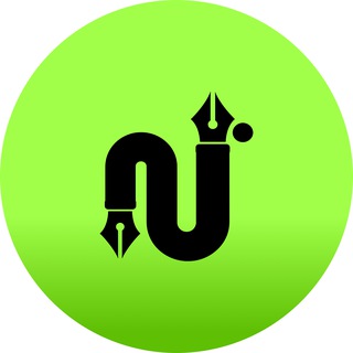
🛠 NASSTUDIO Logo — Behind the Design 🎨✍️
Now that the logo has made its debut…
Let’s talk how it was built 👇
✅ Concept:
The symbol blends creativity + digital craft — merging a stylized “N” with pen-tool nib forms, inspired by design software icons and calligraphy roots.
Why? Because NASSTUDIO stands at the intersection of UI/UX, Front-End & Digital Design Culture.
✅ Shapes & Form:
Smooth continuous curve = flow, precision & modern process
Ink-nib terminals = craftsmanship & attention to detail
Rounded body + sharp tips = soft creativity meets sharp execution
✅ Visual Philosophy:
Minimal, strong, meaningful.
No random shapes — every curve serves clarity, creativity & identity.
More design breakdowns & UI tips dropping soon.
If you're a creator, designer, developer, or just nosy about pixels…
👉 Stick around 😎
💬 Join me here:
https://news.1rj.ru/str/NASEXPRIENCE
🔥2