Media is too big
VIEW IN TELEGRAM
i will make it interactive with the mouse , like you can spread the particles all over the page or smt like that 👌👌👌👌
Media is too big
VIEW IN TELEGRAM
this is the progress of the modern portfolio website .hope it turn out to be the best website . i start this project to level up my skill and to know how much i implement something i think into real project and app,
that good progress 👍👍👍
show your like and i will make it open source once i finish the main screen that im going to add in the next weeks .
open only on the PC to see the progress
https://particle-ring.vercel.app/
that good progress 👍👍👍
show your like and i will make it open source once i finish the main screen that im going to add in the next weeks .
open only on the PC to see the progress
https://particle-ring.vercel.app/
Forwarded from The Software Guy
This media is not supported in your browser
VIEW IN TELEGRAM
The vibe Coder you hired when Claude is down PART 2 😂😂😂
🤣1
Media is too big
VIEW IN TELEGRAM
something is cooking ,hope u like it stay tuned with this channel
most common UI/UX design rules, systems, and principles that designers are expected to know and apply
📐 Layout & Spacing Rules
All spacing and sizing use multiples of 8 (8, 16, 24, 32…)
Ensures consistency and responsiveness
Very common in mobile and web design (Material Design, iOS)
Example:
Padding = 16px, margin = 24px, icon size = 24px
Used when more precision is needed
Often combined with 8-point grid
3. Alignment Rule
Elements should align to a grid or each other
Misalignment makes designs feel unprofessional
🧱 Design Systems & Structure
A way to build UI in layers:
Atoms → buttons, inputs, icons
Molecules → form fields, search bars
Organisms → headers, cards
Templates → page layouts
Pages → real screens with data
Helps with scalability and consistency.
A shared library of:
Colors
Typography
Components
Spacing rules
Improves team collaboration and speed.
🎯 Usability Principles (Very Important)
Bigger and closer elements are easier to tap
Important buttons should be large and reachable
More choices = more decision time
Reduce options to reduce cognitive load
Users prefer interfaces that work like ones they already know
Don’t reinvent common patterns
Humans can hold ~7 (±2) items in memory
Break content into chunks
🧠 Visual Hierarchy & Clarity
Guide the eye using size, color, contrast, spacing
Most important content should stand out first
Text must be readable against backgrounds
Important for accessibility (WCAG)
Space is not empty — it improves readability and focus
🧭 Interaction & Feedback Rules
Every action should have feedback
Examples: loading states, success messages, hover effects
Elements should look interactive if they are clickable
Buttons should look like buttons
Same actions should behave the same everywhere
📱 Mobile & Responsive Rules
Design for small screens first
Forces prioritization of content
Minimum tap size: 44×44 px
Prevents mis-taps
♿️ Accessibility Rules
Sufficient color contrast
Text alternatives
Keyboard navigation
Screen reader support
🧪 Testing & Iteration Rules
Test early, test often
Even 5 users can reveal major issues
Use analytics and user feedback, not assumptions
📐 Layout & Spacing Rules
1. 8-Point Grid System
All spacing and sizing use multiples of 8 (8, 16, 24, 32…)
Ensures consistency and responsiveness
Very common in mobile and web design (Material Design, iOS)
Example:
Padding = 16px, margin = 24px, icon size = 24px
2. 4-Point Grid
Used when more precision is needed
Often combined with 8-point grid
3. Alignment Rule
Elements should align to a grid or each other
Misalignment makes designs feel unprofessional
🧱 Design Systems & Structure
4. Atomic Design
A way to build UI in layers:
Atoms → buttons, inputs, icons
Molecules → form fields, search bars
Organisms → headers, cards
Templates → page layouts
Pages → real screens with data
Helps with scalability and consistency.
5. Design Systems
A shared library of:
Colors
Typography
Components
Spacing rules
Improves team collaboration and speed.
🎯 Usability Principles (Very Important)
6. Fitts’s Law
Bigger and closer elements are easier to tap
Important buttons should be large and reachable
7. Hick’s Law
More choices = more decision time
Reduce options to reduce cognitive load
8. Jakob’s Law
Users prefer interfaces that work like ones they already know
Don’t reinvent common patterns
9. Miller’s Law
Humans can hold ~7 (±2) items in memory
Break content into chunks
🧠 Visual Hierarchy & Clarity
10. Visual Hierarchy
Guide the eye using size, color, contrast, spacing
Most important content should stand out first
11. Contrast Rule
Text must be readable against backgrounds
Important for accessibility (WCAG)
12. White Space (Negative Space)
Space is not empty — it improves readability and focus
🧭 Interaction & Feedback Rules
13. Feedback Principle
Every action should have feedback
Examples: loading states, success messages, hover effects
14. Affordance
Elements should look interactive if they are clickable
Buttons should look like buttons
15. Consistency Rule
Same actions should behave the same everywhere
📱 Mobile & Responsive Rules
16. Mobile-First Design
Design for small screens first
Forces prioritization of content
17. Touch Target Rule
Minimum tap size: 44×44 px
Prevents mis-taps
♿️ Accessibility Rules
18. Accessibility (WCAG)
Sufficient color contrast
Text alternatives
Keyboard navigation
Screen reader support
🧪 Testing & Iteration Rules
19. Usability Testing
Test early, test often
Even 5 users can reveal major issues
20. Data-Driven Design
Use analytics and user feedback, not assumptions
🙏1
https://x.com/NASSTUDI0/status/2006981991439507637?s=20
Three.js really Liked 🚀🚀🤟 my modern website project!
If you’re into creative web experiences, let’s connect on X — follow me, share your thoughts, and let’s grow together.
Also, make sure to join my channel for more behind-the-scenes and updates 🚀
Three.js really Liked 🚀🚀🤟 my modern website project!
If you’re into creative web experiences, let’s connect on X — follow me, share your thoughts, and let’s grow together.
Also, make sure to join my channel for more behind-the-scenes and updates 🚀
NAS STUDIO
https://www.gentlerain.ai/ look it this amazing website
am just try to replicate the water ripple animation like gentelrain web
https://water-ripple-effect-phi.vercel.app/
try it and let me know u thoughts
https://water-ripple-effect-phi.vercel.app/
try it and let me know u thoughts
Biases in UX Design — What Every Designer Must Know!
Bias quietly shapes decisions, research, and product outcomes. Knowing it = designing better, fairer, user-centered experiences.
1️⃣ Confirmation Bias —
Designers often favor feedback that supports their ideas and ignore the rest.
Avoid it by:
• Testing early (low-fidelity first)
• Doing discovery research, not validation
• Asking neutral questions
• Staying emotionally neutral in user testing
• Using multiple data sources
• Inviting fresh external perspectives
2️⃣ Negativity Bias —
Users remember bad UX longer than good UX. One frustration can ruin trust.
Avoid it by:
• Reducing friction in key journeys
• Fixing critical usability issues early
• Ensuring consistency & familiarity
• Designing for clarity, not cleverness
• Prioritizing real user expectations
💡 Why it matters?
Being aware of bias =
✔️ Better research
✔️ Better decisions
✔️ Better products
✔️ Happier users
https://news.1rj.ru/str/NASEXPRIENCE
Good Night 👋👋👋👍👍
Bias quietly shapes decisions, research, and product outcomes. Knowing it = designing better, fairer, user-centered experiences.
1️⃣ Confirmation Bias —
“We only see what we want to see.”
Designers often favor feedback that supports their ideas and ignore the rest.
Avoid it by:
• Testing early (low-fidelity first)
• Doing discovery research, not validation
• Asking neutral questions
• Staying emotionally neutral in user testing
• Using multiple data sources
• Inviting fresh external perspectives
2️⃣ Negativity Bias —
“One bad experience outweighs ten good ones.”
Users remember bad UX longer than good UX. One frustration can ruin trust.
Avoid it by:
• Reducing friction in key journeys
• Fixing critical usability issues early
• Ensuring consistency & familiarity
• Designing for clarity, not cleverness
• Prioritizing real user expectations
💡 Why it matters?
Being aware of bias =
✔️ Better research
✔️ Better decisions
✔️ Better products
✔️ Happier users
https://news.1rj.ru/str/NASEXPRIENCE
Good Night 👋👋👋👍👍
Telegram
NAS STUDIO
This channel is for the grapghic designer and UIUX Designer dudes
More design tips, case studies, and creative chaos coming soon.
Stay tuned 👀
contact the owner @IgnitePasion
More design tips, case studies, and creative chaos coming soon.
Stay tuned 👀
contact the owner @IgnitePasion
❤1
Forwarded from Onyx Design ⚡️
From first sketch to polished logo
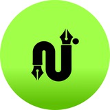
#ጥበብ_አጥር
Logo Concept
@OnyxDesignx
#ጥበብ_አጥር
Logo Concept
“ጥ” — Wisdom & Identity
The abstract form of the Amharic letter ጥ represents wisdom, heritage, and authenticity.
- Fabric-Like Flow
The soft curves mirror the movement of cloth, symbolizing elegance, fashion, and design excellence.
- Fence(አጥር) Protection of Value
The enclosed, balanced shape represents a fence that protects quality, meaning, and refined taste.
@OnyxDesignx
❤🔥1⚡1❤1